When selling a house, how you sell matters
/
The best thing an agent can do for a seller is show them how to best present their house. Marc Dosik of Help-U-Sell Real Estate teaches sellers how to make changes to best showcase the house. The details matter -- and so do the photographs! Here's some hints on how to make your home look the best possible when selling.
On a recent example with Help-U-Sell, a home seller listed his house with a different real estate agent for three months and it did not sell, so he contacted Help-U-Sell because a relative had used them in the past. The seller was open to all suggestions and was very motivated to sell the house, but did not budget a lot of money to spend on improvements. We made suggestions to help, and as you'll see in the photos below, a picture does tell more than a thousand words. Take a look and you’ll see why we sold the house in 11 days! The seller saved over $11,000 in what he would have paid in commissions to a typical 6% real estate company, since Help-U-Sell charges a flat fee instead of a percentage.
After the seller saw the new listing with new photos, he contacted Help-U-Sell: "The pictures look FABULOUS! You are truly in your wheelhouse with this stuff! We can truly see every change/suggestion that you had made all the difference in the way our home shows! Great job! Thanks again, Marc, for your enthusiasm and commitment to helping us through this process.”
Best practice note: Make sure your potential listing real estate agent shows you how he or she has marketed and presented previous listings before you sign on the dotted line!
Photography Matters!
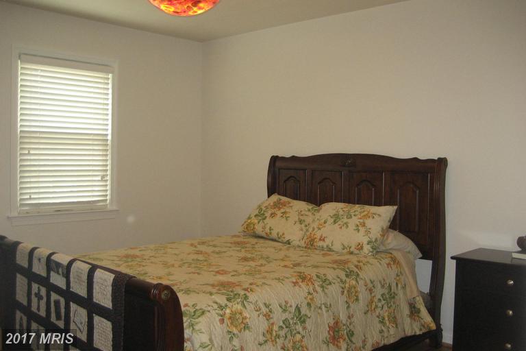
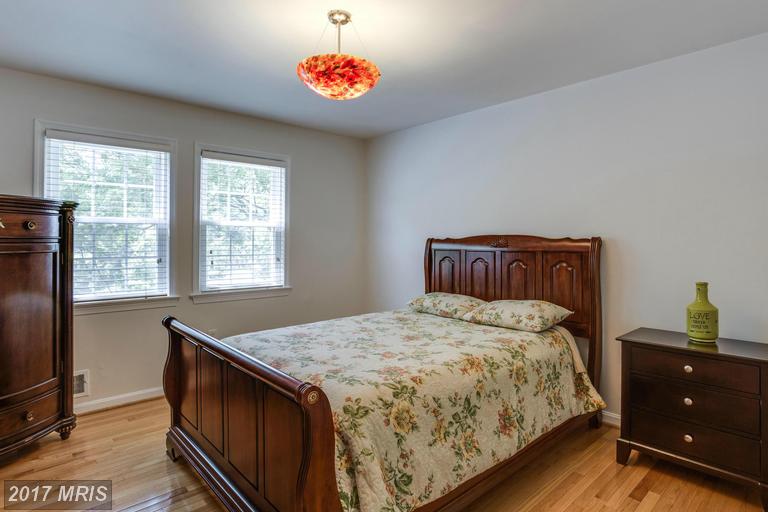
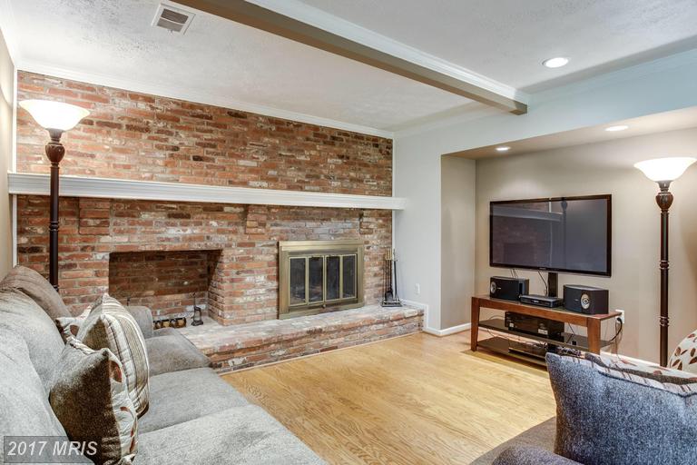
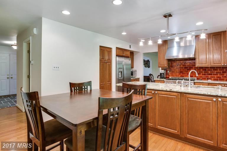
Here are some “BEFORE” and “AFTER” photos on the multiple list service showing the photos the prior agent took before the seller listed with Help-U-Sell, and the photos taken after the seller contacted Help-U-Sell.
Photos on the left were taken by their previous agent (the one who did not sell their house). Help-U-Sell hired a professional photographer who took the photos on the right. Note the poor lighting in all “Before” photos, making the house look dark and dingy, compared to the lighting and perspective in the new photos. This is the difference between amateur photos and professional photography.
First... Make it Look Good: See how these two front yard pictures differ. In the former agent's picture, the door is dark and shaded by the angle of the photo – not inviting. The lawn looks drab. In our photo, the sunlight enlivens the picture.
Use the Right Scale: Our photo of the back yard is taken further from house, making the yard appear larger. The whole house is in the shot by using a wide-angle lens.
Spotlight the Highlights: The prior agent completely omitted the backyard patio.
Use Light to Make Your Home Shine: In this bedroom, notice the closed blinds in the first photo, blocking outside light. In Help-U-Sell's photo on the right, the room looks brighter and larger. The wide-angle lens captures more of the room, and isn't just a picture of the seller’s furniture. Plus, you can see the trees outside the window.
Focus on the Room, not the Furniture: All the older bedroom photos shared the same issues. We made them look great and used a wider-angle lens and brightened up the rooms, and we had the sellers use brighter light bulbs for the photos.
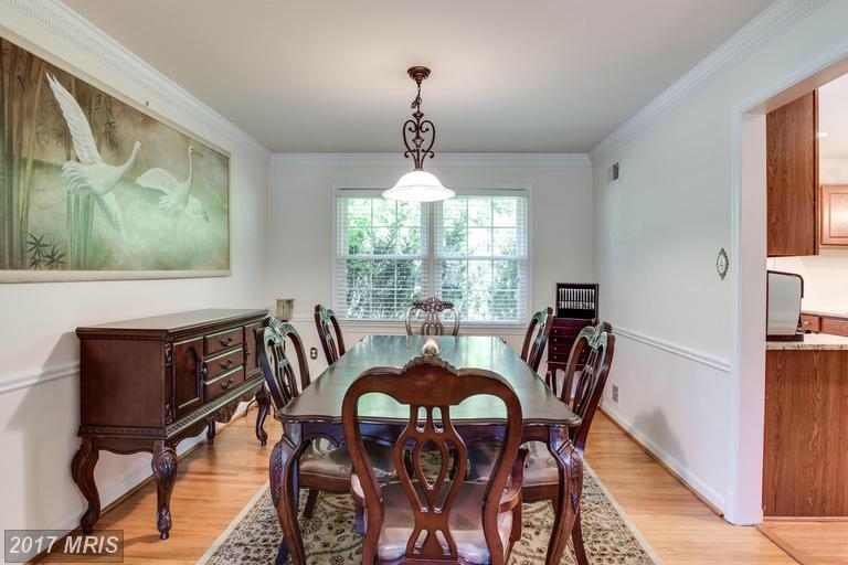
Make the Living Spaces Look Livable: In the Dining, Family and Living Rooms, we added more light and opened up the blinds, and had the sellers replace all recessed lights with the brightest possible bulbs. In the Living Room, we removed the throw rugs to show off the gleaming hardwood floors and make the photo less “busy.” (Not judging here, but many sellers’ throw rugs are unappealing to buyers. YMMV) Without the rugs, the rooms look sleek and more modern. We agains used a wider angle lens. Our photo shows how the dining room leads into the kitchen.
Change the Colors, Remove the Clutter: In the picture of the kitchen below, the family room in the back is so dark you can hardly tell what it is. The mustard paint and red backsplash in the kitchen were too bold for most buyers. Since painting is less expensive and easier to do than removing a backsplash, we had the seller paint a more neutral color that complemented the red backsplash. We also had the sellers remove all knick-knacks from the top of the fridge and cabinets, remove the paper towel holder, shelving units, and the like, to make the kitchen appear its best.
Vertical Versus Horizontal Images: In the bathroom, the older vertical photo appears small and leaves a lot of white space when viewed in a gallery, and looking at the plumbing isn't a selling oint. Our photographer used a horizontal shot and better lighting.
Focus on What's Important: In the basement, the picture on the left is the only photo of the large lower level from the previous agent. This speaks for itself. Unless you're selling just your pool table, this sells nothing. Show the space! It looks great!
Remember, when you're listing your home, how you sell matters. Have questions? Contact Marc Dosik from Help-U-Sell.
Marc Dosik
Help-U-Sell Federal City Realty
843 Upshur Street NW
Washington, DC 20011
(202) 543-7283
This is a sponsored post for Help-U-Sell Federal Realty, owned by agent Marc Dosik and located at 843 Upshur Street NW in Petworth. Marc is an active member of the Petworth business community and a sponsor of the Petworth News blog.


